 My personal favorite- the dining room. I love the blue/gray paneled wall and the head chairs. This is definitely "me"...what I would do for myself. A big thank you to "Witford" at the Laguna Design Center for their help in sourcing the chairs and the perfect chandelier for the room.
 Family room: With many projects, the rooms never quite get 100% done, for time reasons, budget etc. This room was the exception and finished to every detail. Looking back at it, I think the cowhide ottoman is a bit much/busy for the room. The pillows could have been simplified as well, but hey, there was no time to make changes. For this room a big high five to Kravet fabrics for helping with pillows, the orange chair, and the window treatments.
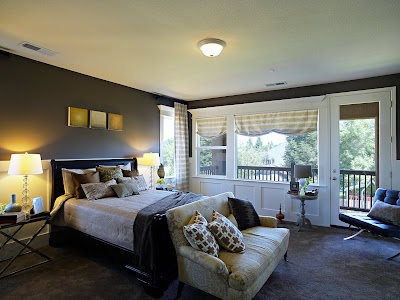
The bedroom was deemed "too masculine". Whether it is or is not, it's a cozy space that most everyone loved.
 No one seemed to be into the green wall. That was fine and the acceptance of it was not my intent. Since it was a competition, I wanted something people would remember. Although I love the rest of the home, nothing seemed to leave a distinct visual memory...but this did. Whether you like it or not, it is a cool catch-all space for the young ones that you can appreciate for what it is, and the vibe it puts out.
 Nook: some small slipcovered chairs soften up an open space. Thanks again to Kravet for the fabrics and wallcovering, and Witford for the light from Visual Comfort.
 Kitchen: Of all the things that I worked on, this was the easiest. I specified the wood finishes, counters, tile, and cabinet configuration and it was all taken care of from there...well I guess I need to include the sink, faucet, hood, decor, barstools, lighting, cabinet pulls...OK it was not that simple I guess but it came out exactly how I hoped.
 Thanks to everyone who helped with product, construction, production and support.

I haven't seen the episode yet (had my parents tivo it so I could watch it later since we don't have HGTV), but from these pictures I LOVE the bedroom and don't think it is too masculine. The browns comfort me, so if that were my bedroom I would feel great about it! Also, I love the green wall. It is fun! Congrats on winning!! Can't wait to watch!!
ReplyDeleteAlbert and I want this house! Absolutely gorgeous!!!
ReplyDeleteOkay, late to the take. Just saw the episode and think your design is LOVELY. Where can I possible see more photos of the kitchen. So I don't over do on questions here, is there some where I can get info on materials. specifically countertops. Kashmir White and Black Pearl? It's gorgeous. I could live there in a minute! Well done!
ReplyDelete